
“Wahoo” Entry #5
Previsualization Version two & Sculpting In Time
The titular idea in Tarkofsky’s Sculpting in Time, influenced the previs revision. Tarkovsky explains that the cinematic medium inherently presents time. The director has the choice to display only the information they please.
It was essential that the information presented be refined. The importance of the “oner” requires a balance between emotional necessity and technical restrictions. The guiding light behind this choice is the desire to communicate the bike riding flow-state. The technical restrictions are pulling off the marriage of CG and live action elements. It’s important that the information presented is efficient.
Introduction
The previous introduction, though striking, had some hangups. It was physically improbable to film, and possibly dizzying.
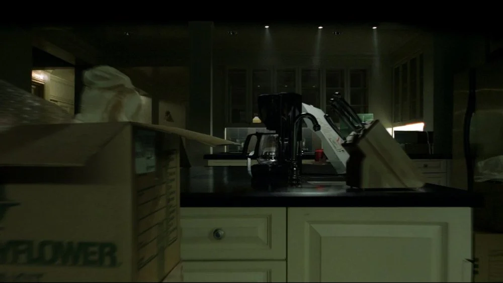
Firstly, the Blackmagic Pocket Pro would have to dolly through the actor’s stomach. Of course there are workarounds for this. I considered using two separate people’s arms or photogrammetry. This causes more problems than it solves.
Secondly, I do not want to alienate a potentially nauseous audience. During the end of quarter show, the large screen accentuated the motion. The new introduction won’t immediately disorient the inner-ear of a poor great grandparent at the end-of year show. Ultimately, I am trusting the audience by condensing the camera move into a simpler motion.
Previously not pictured, was the ‘Wahoo’ monograph on the screen of the Wahoo Bolt. I want to sell the brand by using recency theory to its full advantage. The classic brand-name fade at the end of the spot communicates Wahoo’s trustworthy ethos. The trick is to communicate that professionally while catering the joy of riding to a cycling audience.
In Panic Room (2002), the oner through the house includes a section where the camera dollies through the handle of a coffee pot. This effect still makes me giddy. By including a similar effect with the brand name, it communicates the intended emotional effect.
In Panic Room (2002), the oner through the house includes a section where the camera dollies through the handle of a coffee pot. This effect still makes me giddy. By including a similar effect with the brand name, it communicates the intended emotional effect.
Sea of Simulation
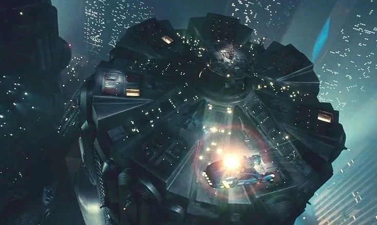
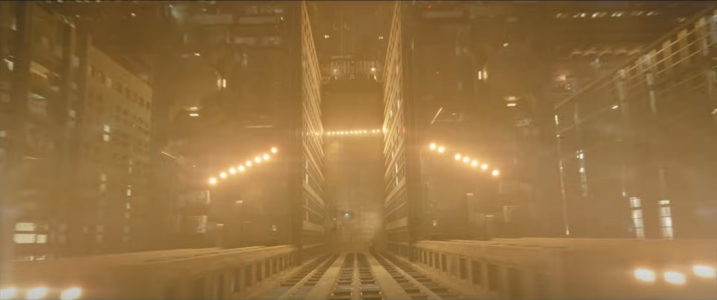
The camerawork in the second scene, Sea of Simulation, has been reworked. Previously, I tried to emulate the framing of the LAPD in Blade Runner. This choice was visually jarring because of the harsh change in velocity. Also, a similar framing would be used for the Wahoo ACE at the end. As the saying goes, “Kill your darlings.”
Additionally, I decided to get rid of the “Why I Roam” text. Though that film series inspired that project, it does not define this one. This spot visualizes not only the Wahoo Roam, but the entire GPS bike computer lineup.
The emotion “sell” behind the Sea of Simulation is how Wahoo products are designed from their core for cyclists. Visualizing the electronic mechanisms as if they are powered by a bike drives this theme home.
To lean into the microscopic scale motif, I will use a longer lens and an appropriate camera velocity through the environment. In “The Batman,” the titular character undergoes a base jump from the Gotham police building. The “Gopro-style” approach from Matt Reeves and Greg Frasier is the perfect adrenaline rush. I can use a similar camera motion that communicates the scale of Bolt’s interior while suggesting a microscopic zoom through an orthagonal camera angle.
Bolt HeightField Roam
The main update here is the smooth(er) camera motion. Otherwise, it is important to note the reoccurring “Wahoo” name. When the computer is textured, the logo will go on the nose of the chassis. I have specifics pertaining to the approach of this section in the upcoming post. Stay tuned!